YouTube Thumbnail Strategy: The Design Decisions That Drive CTR for TikTok & Short‑Form Agencies
Learn the color, contrast, face, text, and composition tricks that boost thumbnail CTR for TikTok agencies repurposing content on YouTube Shorts.
On YouTube Shorts the thumbnail is the only visual cue before autoplay. A strong cover decides whether the algorithm pushes the video to the “For You” feed or buries it. For agencies that already spend hours on script, shoot, and edit, a 0.2‑second decision point can make the difference between viral lift and flat performance.

Why Thumbnails Matter for Repurposed Shorts
“If the thumbnail doesn’t stop the scroll, the content never gets a chance.” – Senior Creative Lead, TikTok Agency
Color & Contrast: Cutting Through the Feed
High‑saturation palettes create visual pop on a sea of muted backgrounds. Pair a dominant brand hue with a complementary accent and lock the contrast ratio above 4.5:1 for legibility on mobile screens.
- Neon teal on dark gray – draws the eye instantly
- Warm orange against deep navy – signals urgency
- Electric pink with black – works for fashion & lifestyle
“Contrast is the silent salesperson; it tells the viewer where to look without a word.”
Faces & Emotions: The Instant Hook
Human faces trigger the brain’s empathy circuit. Use a close‑up with a clear expression that mirrors the video’s core promise – surprise, joy, or curiosity.
- Eye‑level framing, not too low or high
- Exaggerated eyebrows for shock value
- Visible teeth for genuine happiness
“A smiling face can lift CTR by up to 23% in short‑form vertical feeds.” – Internal case study
Text Overlays: Clarity Meets Boldness
Only 3–5 words belong on a thumbnail. Choose a sans‑serif font that stays legible at 1080×1920px and apply a 2‑pixel stroke or drop shadow for separation from the background.
- Upper‑case, all‑caps for urgency
- High‑contrast color (e.g., white text on dark background)
- Keep the keyword front‑loaded – “How to…” or “3 Tips…”
“If the text can’t be read in a split second, the thumbnail fails its job.”
Composition & Visual Hierarchy for Mobile Screens
Mobile viewers scan from top‑left to bottom‑right. Position the focal point (face or product) in the upper‑right third, then layer the text in the lower‑left, preserving a clear visual path.
- Leave a 5% safe zone around edges for platform cropping
- Use negative space to isolate the main element
- Apply a subtle gradient overlay to keep text readable
“Good composition is the silent guide that whispers ‘click me’ to the viewer.”
Speeding Up Iteration with AI‑Native Tools
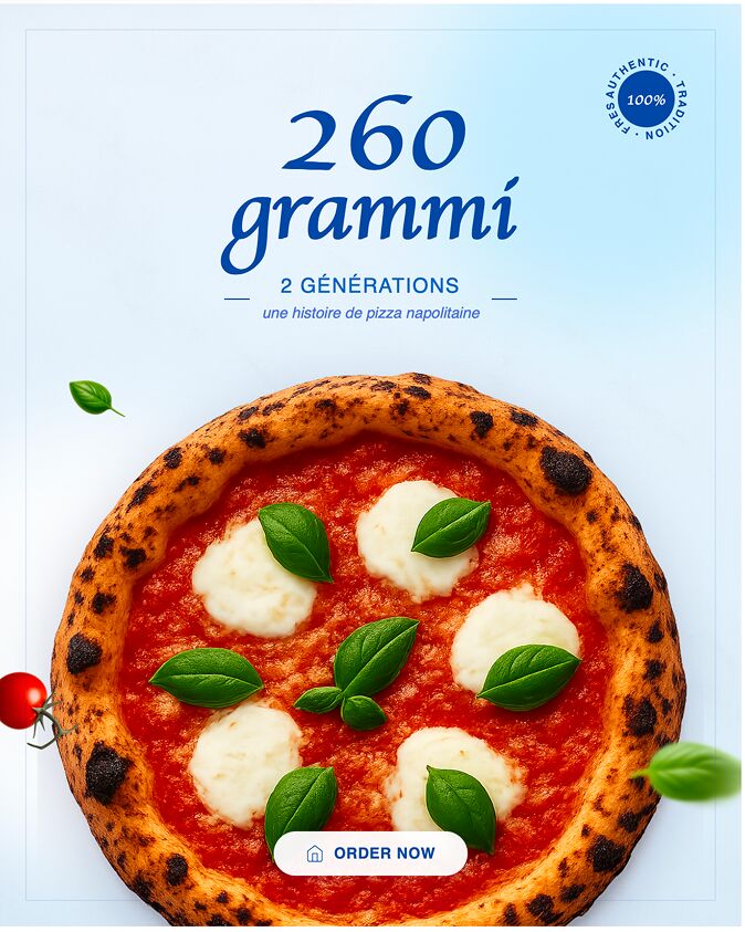
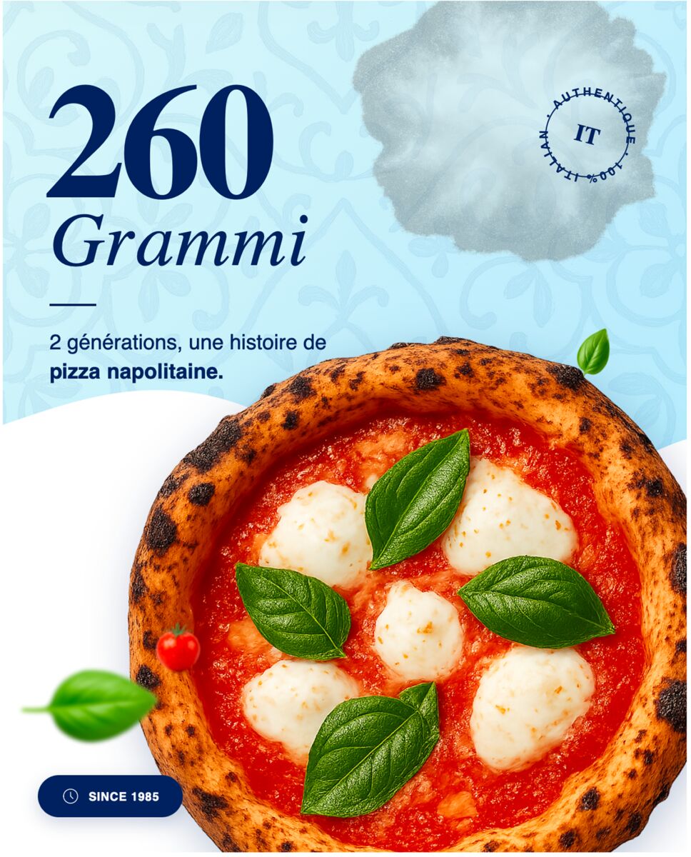
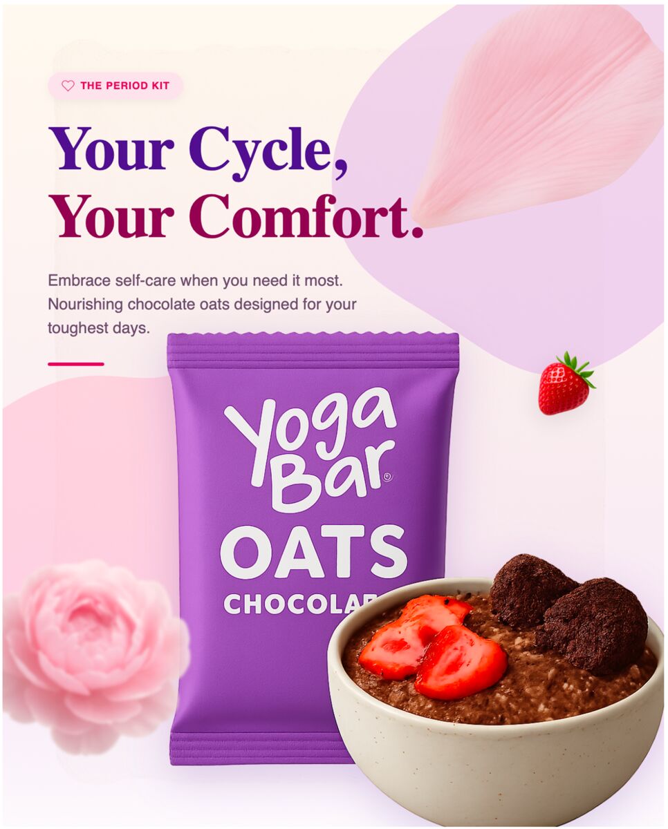
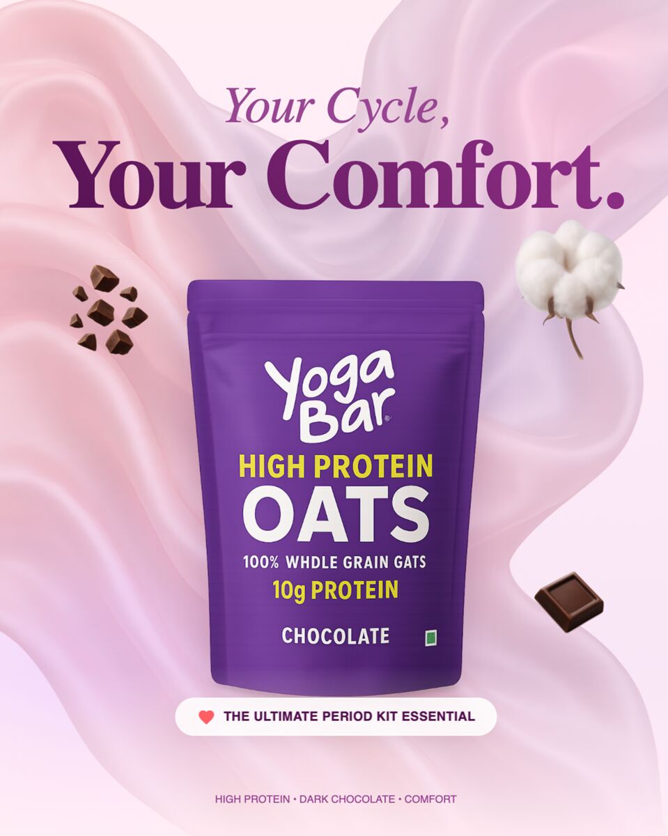
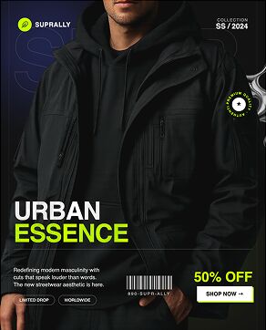
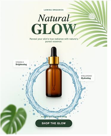
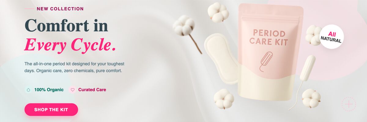
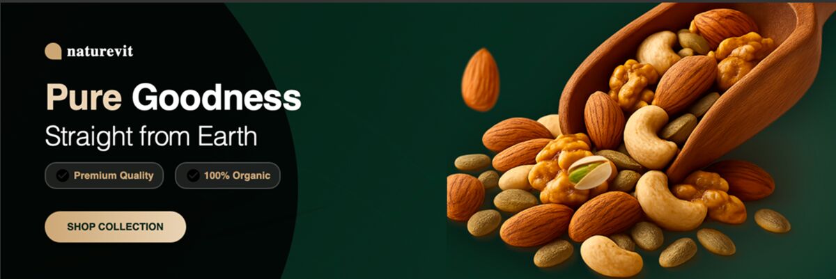
When you need three thumbnail variations in ten minutes, template libraries become a bottleneck. DesignLumo’s AI Social Media Posts generates fully editable, layered thumbnails from a single prompt, letting you swap colors, faces, or copy in seconds.
- Write a prompt: “Bold teal background, close‑up smiling teen, ‘3 Hacks’ in white Montserrat.”
- Export the PSD‑ready file, adjust any brand color in the layer panel.
- Publish, monitor CTR, and iterate – all without leaving the design canvas.
“AI‑first design cuts thumbnail turnaround from hours to minutes, keeping the creative edge sharp.”
Topics covered
Create with DesignLumo






Ready to create your first design?
Join thousands creating professional designs in seconds.
Related articles
The Design Handoff Process That Saves Hours Every Week
Learn a streamlined handoff workflow for TikTok agencies—file naming, folder structure, and export formats that cut back‑and‑forth by hours each week.
Designing Posts That Drive Engagement, Not Just Impressions for YouTube Growth Agencies
Boost YouTube CTR, saves, and comments with proven visual and copy tactics. Learn A/B testing, community graphics, and AI‑editable design workflows.
LinkedIn B2B Content Strategy: Generating Leads Through Design for YouTube Growth Agencies
Learn how YouTube growth agencies can turn LinkedIn visuals into a lead engine—thumbnail tactics, brand kits, A/B testing, and AI‑generated design.