TikTok Brand Content: Designing for Native-Feeling Ads
Learn how YouTube growth agencies can design TikTok ads that feel native, boost thumbnail CTR, and streamline A/B testing with AI tools.
TikTok’s algorithm rewards content that blends seamlessly with user‑generated videos. The feed is vertical, fast‑paced, and text‑heavy. Anything that looks staged or overly polished gets pushed down.

What Makes TikTok Feel Native?
- Full‑screen vertical canvas (9:16)
- Dynamic text overlays that appear within the first 2 seconds
- Bright, high‑contrast colors that pop against the dark background of the app
- Subtle motion—zoom, pan, or shake—that feels like a handheld capture
If it looks like a TikTok video, the algorithm will treat it like one.
Mapping Your YouTube Brand Assets to TikTok
Your client’s logo, color palette, and typography are the backbone of brand consistency. The trick is to reinterpret them for TikTok’s visual language without losing recognizability.
- Scale the logo to 15‑20% of the frame and place it in a corner for quick brand recall.
- Swap serif fonts for bold, sans‑serif types that stay legible on small screens.
- Apply the brand color as an accent—border, text highlight, or background gradient—rather than a full‑screen wash.
Brand equity survives when you let the platform’s rules dictate the visual hierarchy.
Designing Thumbnails That Convert in a Vertical Feed
TikTok shows a cover frame before playback. That frame functions as the thumbnail and directly drives click‑through rate (CTR).
Use AI Marketing Design to spin up fully editable, layered cover frames in seconds. The AI respects your brand kit while delivering a fresh, vertical layout each time.
- Place a bold hook phrase in 2‑3 words, sized to dominate the lower third.
- Add a high‑contrast silhouette of the main subject to create instant curiosity.
- Leave negative space for TikTok’s overlay icons (sound, captions) so they don’t obscure key elements.
A thumbnail that reads without sound is the only one that survives the scroll.
Modular Premiere & Community Tab Graphics
Premiere screens and community posts share the same visual DNA. Build a modular template that can be re‑styled on the fly for each campaign.
- Create a hero image layer that swaps per video theme.
- Keep a persistent lower‑third banner for the channel logo.
- Add a call‑to‑action button layer that you can edit without touching the base design.
DesignLumo’s AI Social Media Posts lets you duplicate the core layout and replace only the hero image, cutting production time by 70%.
A/B Testing Creative Variants at Scale
You can’t rely on a single thumbnail or banner. Run systematic A/B tests using TubeBuddy’s split‑testing feature, feeding it multiple AI‑generated variants.
- Generate 3‑5 cover variants with DesignLumo, each tweaking color emphasis or text placement.
- Upload each variant as a separate draft in TikTok’s ad manager.
- Let the platform allocate equal spend for 48 hours, then compare CTR and completion rate.
Data‑driven design beats intuition every time—especially when the data comes from the platform itself.
Integrating the Production Pipeline
Your current workflow—DaVinci Resolve for video, Photoshop for graphics—can stay intact. Insert DesignLumo after the edit but before upload.
- Export the final video clip from DaVinci Resolve.
- Feed the video title and hook into DesignLumo to auto‑create the cover frame.
- Download the layered PSD, make any last‑minute tweaks in Photoshop, then push to TikTok.
Treat AI as a co‑pilot, not a replacement, to keep creative control while gaining speed.
Metrics That Prove “Native” Success
Once the ads are live, focus on the metrics that matter for native perception.
- Thumbnail CTR — aim for 6‑8% on TikTok’s ad platform.
- 3‑second video play rate — a high rate signals that the thumbnail feels organic.
- Average watch time — compare against non‑native, template‑based creatives.
When native‑looking ads achieve the same or higher watch time, you’ve cracked the formula.
Topics covered
Create with DesignLumo
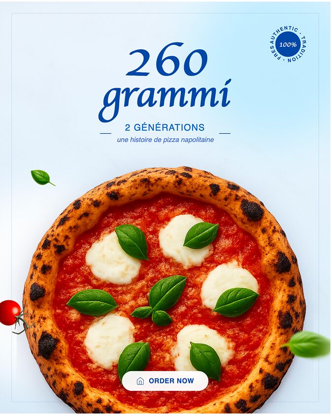
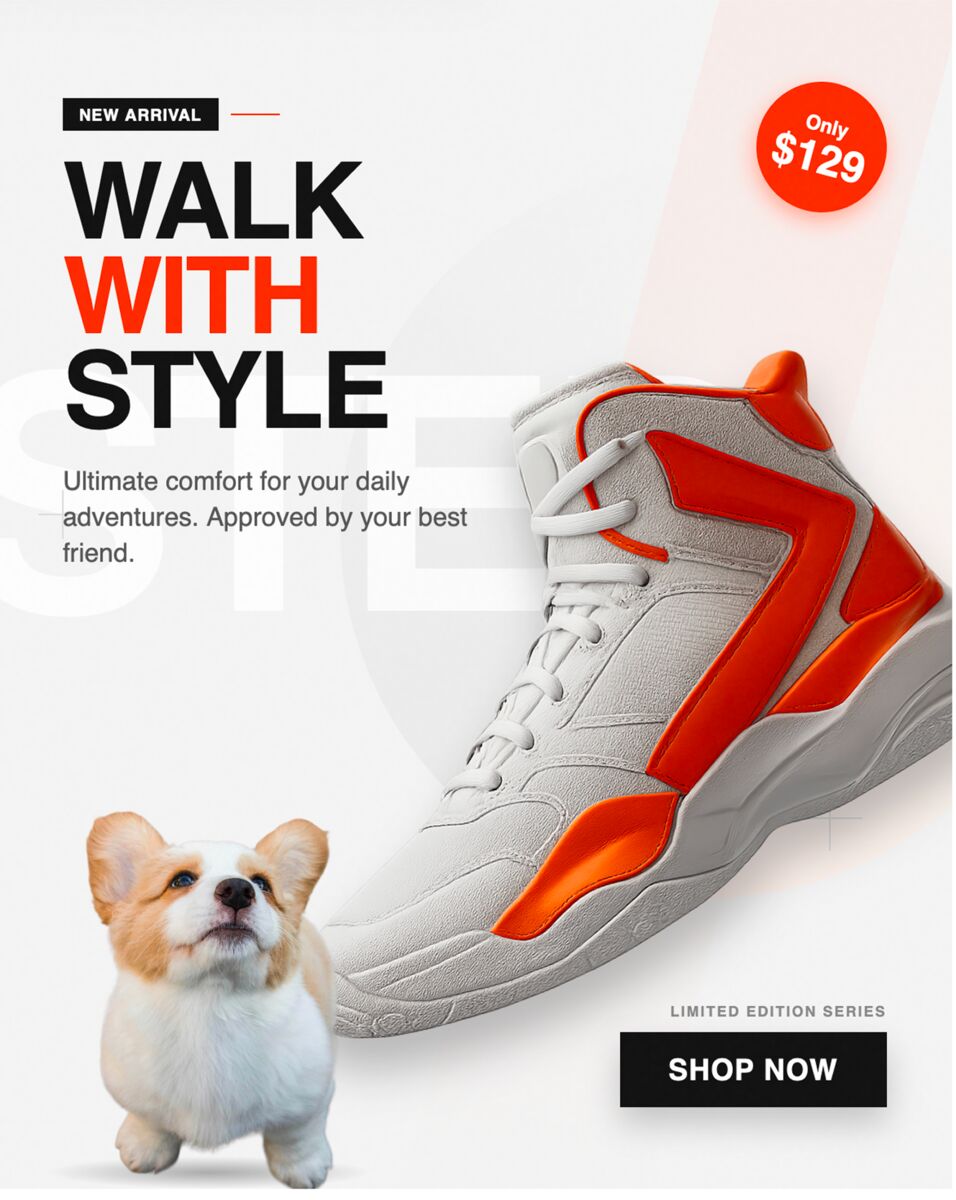
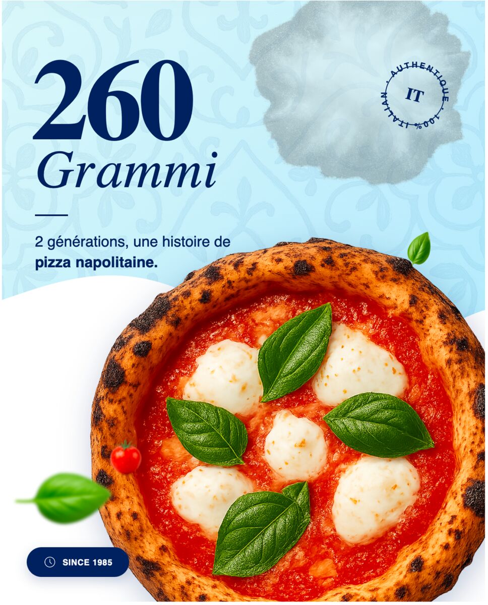
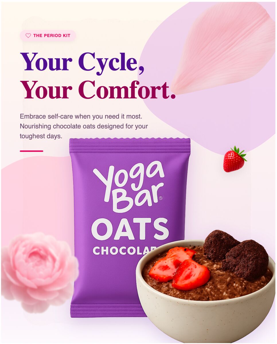
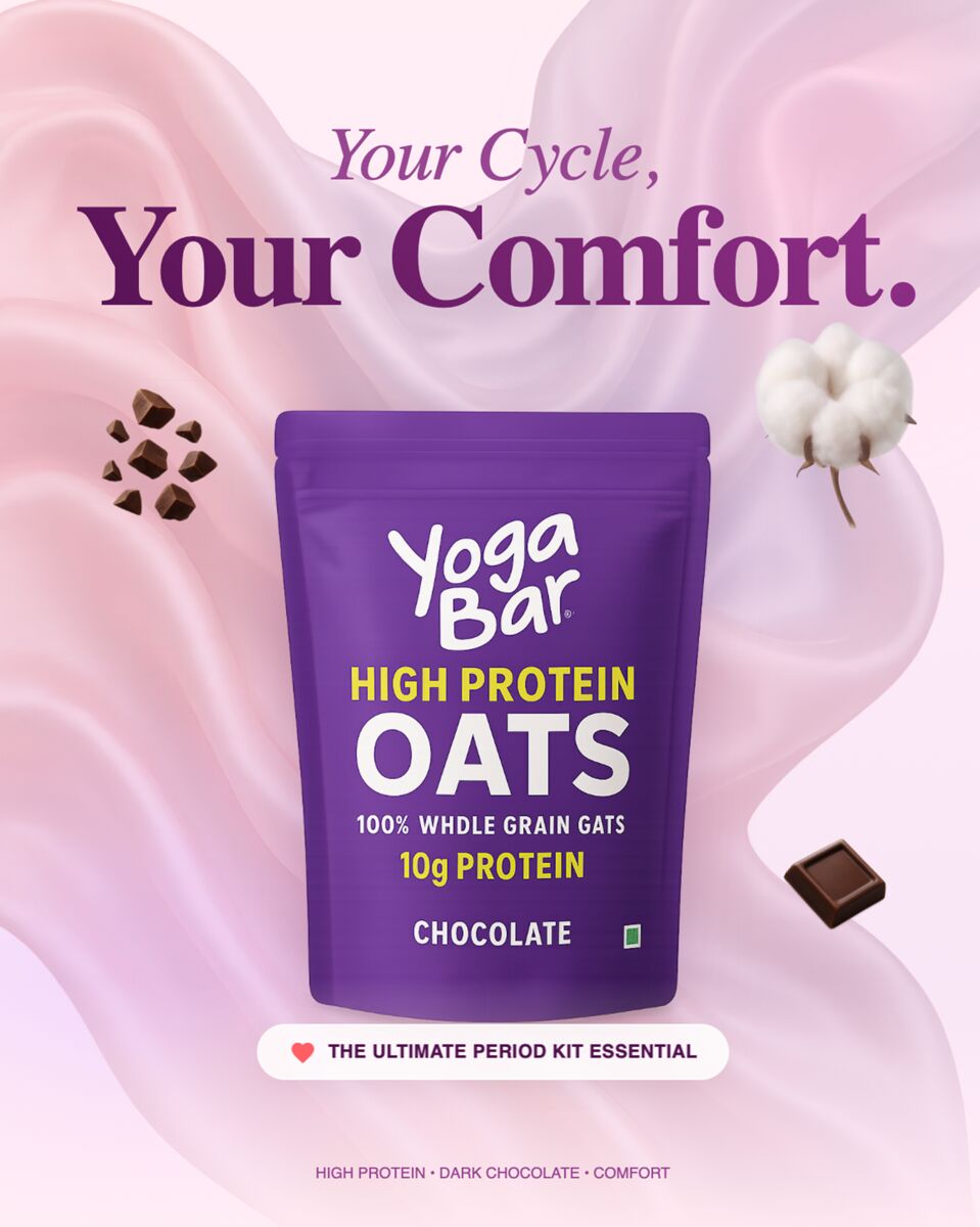
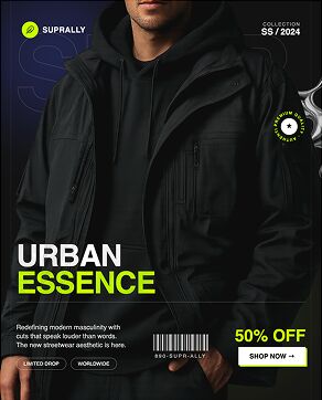
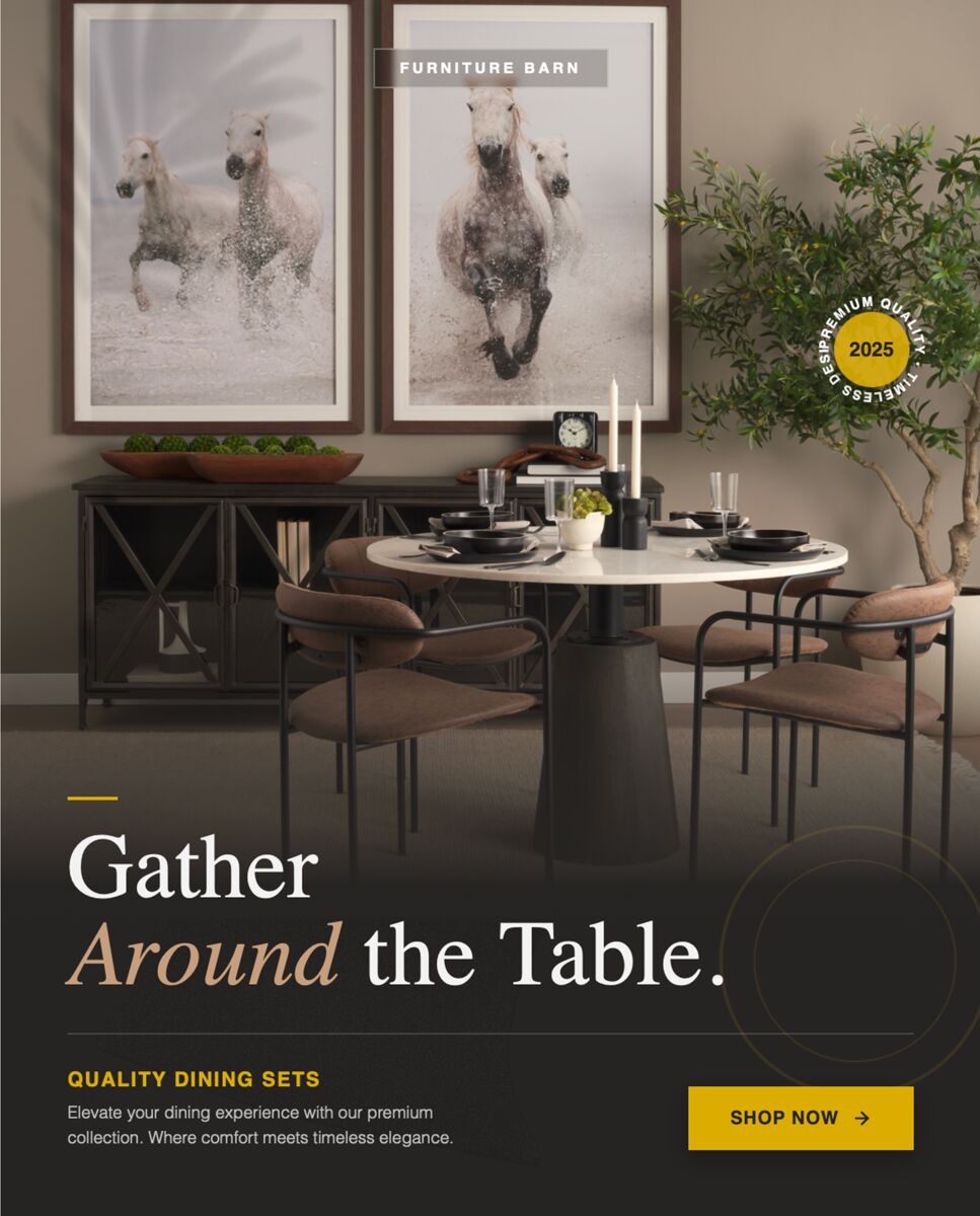
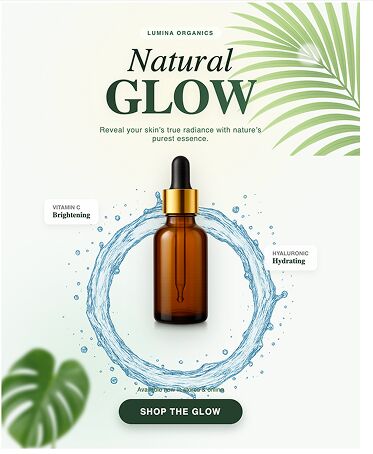

Ready to create your first design?
Join thousands creating professional designs in seconds.
Related articles
A/B Testing Ad Visuals: What Actually Moves the Needle
Learn which visual elements to test, how to structure reliable A/B experiments, and read results that truly lift ROI for agency clients.
A/B Testing Email Visuals: What Actually Moves the Needle for Agencies
Learn which email header and hero image elements to A/B test, how to structure experiments, and read results that boost e‑commerce and SaaS campaigns.
A/B Testing Ad Visuals: What Actually Moves the Needle for YouTube Growth Agencies
Learn the visual elements that truly boost thumbnail CTR for YouTube agencies, how to structure A/B tests, and read results that drive growth.