Email Design Best Practices for Marketing Agencies in 2026 – YouTube Growth Edition
Learn 2026 email design tactics for YouTube growth agencies—header hacks, image/text balance, mobile optimization, and high‑converting CTAs.
Email remains the most direct line to a creator’s core audience. A well‑crafted newsletter can surface new uploads, drive watch time, and boost subscriber churn‑rate in ways that algorithmic feeds cannot.

Why Email Still Drives YouTube Growth
Industry benchmarks show open rates above 30 % and click‑through rates (CTR) of 6‑8 % for niche channels. Those clicks translate into immediate views, signaling relevance to YouTube’s recommendation engine.
Header Design that Hooks the Viewer
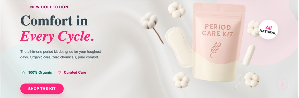
The email header is the first visual cue. Keep the type bold, legible, and sized between 28‑32 px. Use a high‑contrast background that mirrors the thumbnail palette to create visual continuity.
- Bold, legible type at 28‑32 px
- Contrast‑rich background aligned with thumbnail colors
- Micro‑preview of the video title or key phrase
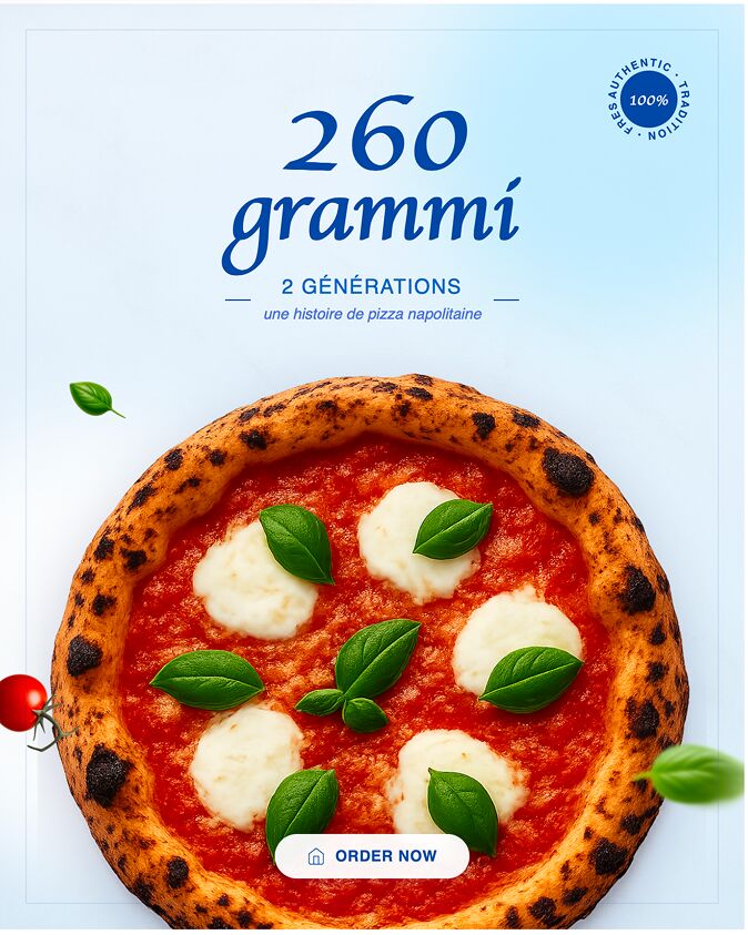
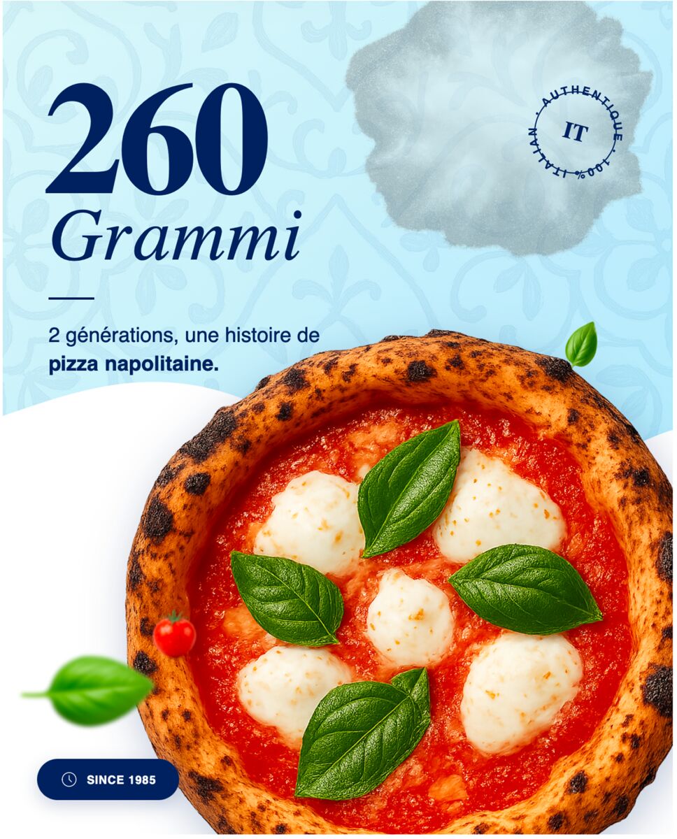
When you need a fresh header for each campaign, skip static templates and generate a fully editable version in seconds with AI Marketing Design.
Balancing Image‑to‑Text Ratio for Mobile Readers
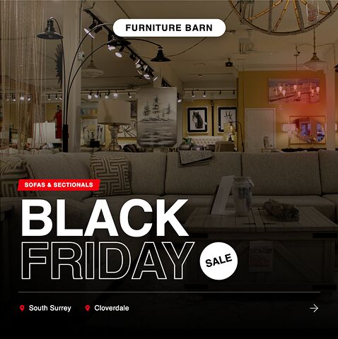
Mobile inboxes dominate viewership. Aim for a 60/40 split: the primary visual occupies roughly 60 % of the width, while copy stays concise and positioned beside it.
- Primary visual (thumbnail snapshot) takes ~60 % of the width
- Supporting copy limited to 2‑3 short lines
- Generous whitespace to prevent tap‑fatigue
Run quick A/B tests on the visual vs. copy balance; even a 5 % shift in image size can move CTR by 0.8 %.
Mobile‑First Optimization: Fonts, Buttons, and Layout
Design for the smallest screen first. Use a responsive font stack (system UI, Roboto, Helvetica) and ensure tap targets meet the 44 px minimum for comfortable clicking.
- Responsive font stack (system UI, Roboto, Helvetica)
- Tap‑target size ≥44 px
- Single‑column layout that collapses under 600 px
If it looks good on a 5‑inch screen, it will look good everywhere.
Strategic CTA Placement that Increases Click‑Through to Videos
Position the primary CTA above the fold, linking directly to the new video. A secondary CTA in the footer can prompt channel subscription or a playlist follow.
- Primary CTA above the fold, linked to the video URL
- Secondary CTA in the footer for channel subscription
- Action verbs + urgency (Watch Now, Limited Spot)
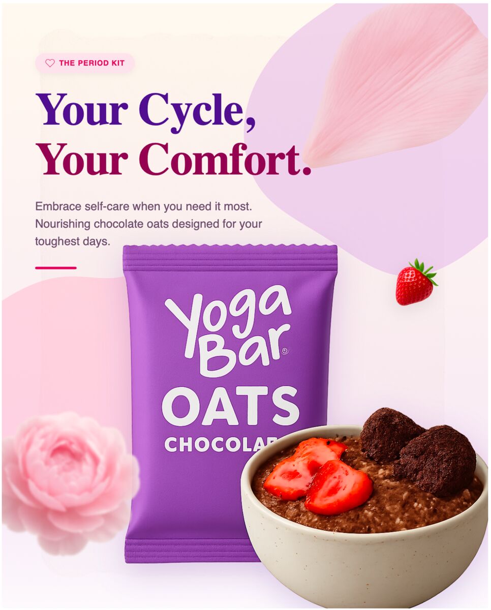
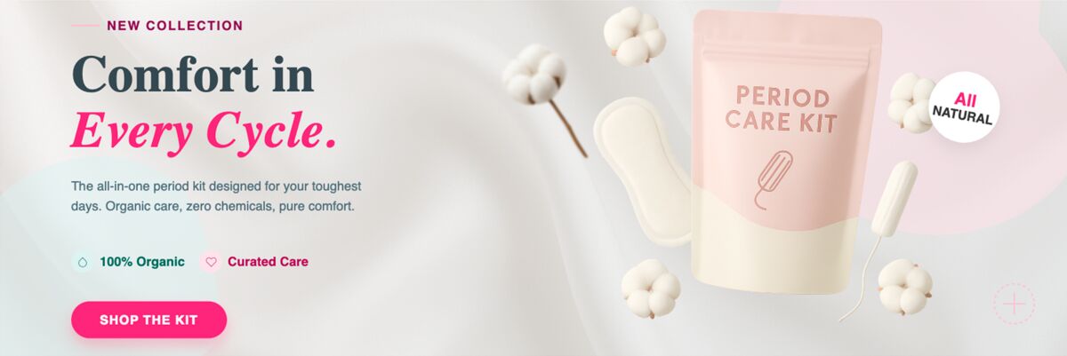
DesignLumo’s Email Header Maker lets you swap button colors and copy on the fly while preserving the same layer structure, so you can iterate without rebuilding from scratch.
A/B Testing Email Variants Efficiently
Test one element per send—header, image‑to‑text ratio, or CTA. Run each variant to at least 1,000 recipients to achieve statistical relevance.
- Test one element per send (header, image ratio, CTA)
- Run at least 1,000 recipients for statistical relevance
- Use TubeBuddy’s link tracking to feed back into video performance
Iterate weekly: collect open and click metrics, adjust the winning element, and repeat. The cycle keeps your email funnel aligned with the fast‑moving YouTube algorithm.
Topics covered
Create with DesignLumo









Ready to create your first design?
Join thousands creating professional designs in seconds.
Related articles
A/B Testing Email Visuals: What Actually Moves the Needle for Agencies
Learn which email header and hero image elements to A/B test, how to structure experiments, and read results that boost e‑commerce and SaaS campaigns.
A/B Testing Ad Visuals: What Actually Moves the Needle for YouTube Growth Agencies
Learn the visual elements that truly boost thumbnail CTR for YouTube agencies, how to structure A/B tests, and read results that drive growth.
Ad Creative Formats That Actually Convert in 2026
Discover the 4 LinkedIn ad creative formats that drive real B2B leads in 2026 and how agencies can produce them at scale with AI tools.