Email Design Best Practices for Marketing Agencies in 2026
Actionable email design tips for social media agencies: headers, image‑text balance, mobile, CTA placement, and faster revisions.
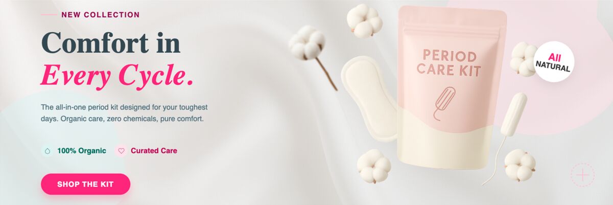
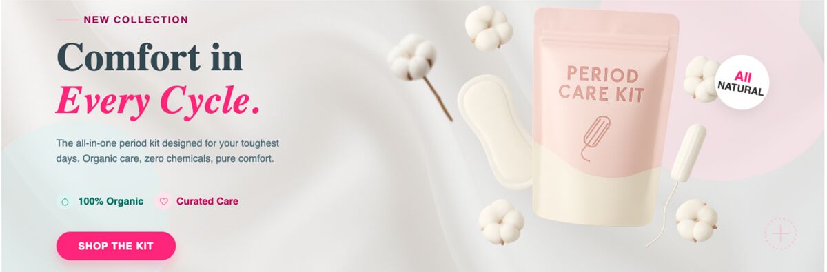
A strong header sets the visual hierarchy and reinforces the client’s brand in seconds. Use a consistent font stack, brand colors, and a clear logo placement. When the header is built as a reusable layer, you can swap copy or logos without breaking the layout.

1. Build a Scalable Header System
- Keep the logo no larger than 120 px in height for mobile readability.
- Limit headline length to 45 characters; longer copy pushes the CTA off‑screen.
- Add a subtle background texture that can be toggled on/off for A/B tests.
Design once, edit everywhere – that’s the mantra that turns a header from a static image into a brand‑consistent asset.
2. Optimize Image‑to‑Text Ratio
Clients love visual impact, but too many pixels kill load speed and dilute the message. Aim for a 40/60 split: 40 % image, 60 % copy.
- Compress images to under 150 KB using WebP or AVIF.
- Use SVG icons for decorative elements; they scale without extra weight.
- Place alt text that mirrors the headline to boost accessibility and SEO.
Every extra kilobyte is a potential lost click.
3. Design Mobile‑First, Then Refine for Desktop
Over 70 % of email opens happen on phones. Start with a single‑column layout, 100 % width, and a 16 px base font. Then add desktop‑only sections like sidebars or secondary images.
- Set the preheader text to 35‑45 characters; it appears as the first line on mobile inboxes.
- Use padding of at least 20 px around clickable elements to avoid tap errors.
- Test with Litmus or Email on Acid before each client send.
If it looks good on a 5‑inch screen, it will look great everywhere.
4. Place CTAs Where the Eye Naturally Travels
The primary CTA should sit below the main copy, centered, and stand out by at least 4:1 contrast. A secondary link can appear in the footer for less aggressive offers.
- Button height: 44‑48 px for thumb‑friendly taps.
- Use action verbs – “Download Guide”, “Start Free Trial”.
- Add a subtle hover state even in email clients that support it (e.g., Gmail web).
When you need a fresh CTA design quickly, the AI‑native Email Header Maker can spin out a fully editable button set that matches any brand kit.
5. Cut Revision Loops with Editable AI Assets
Clients often request small copy tweaks or color swaps. Traditional template tools force you to rebuild layers. An AI‑first platform delivers a layered file you can edit on the fly, slashing turnaround from days to minutes.
- Store each email as a master file; duplicate for new campaigns.
- Link the master to the client’s brand kit so color updates propagate automatically.
- Export directly to HTML with inline CSS to avoid rendering glitches.
Try the Ad Creative Maker for rapid CTA button variants – it generates fully layered designs you can hand off to developers or copy editors instantly.
Topics covered
Create with DesignLumo




Ready to create your first design?
Join thousands creating professional designs in seconds.
Related articles
Ad Creative Formats That Actually Convert in 2026
Discover the four ad creative formats that drive real conversions in 2026 and how agencies can deploy them at scale.
Ad Creative Formats That Actually Convert in 2026
Discover the 4 ad creative formats that consistently convert email campaigns in 2026, with clear use‑cases for e‑commerce and SaaS agencies.
Ad Creative Formats That Actually Convert in 2026
Discover the 4 LinkedIn ad creative formats that drive real B2B leads in 2026 and how agencies can produce them at scale with AI tools.