Creating Shopify Banners with AI: A Simple Step-by-Step
Create Shopify banners faster with AI. A simple workflow for sizes, messaging, and conversion-focused design.
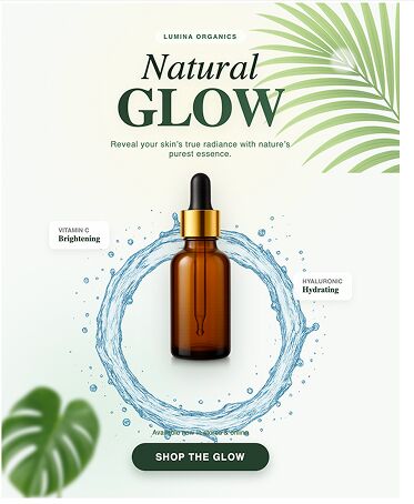
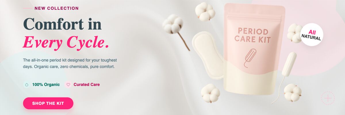
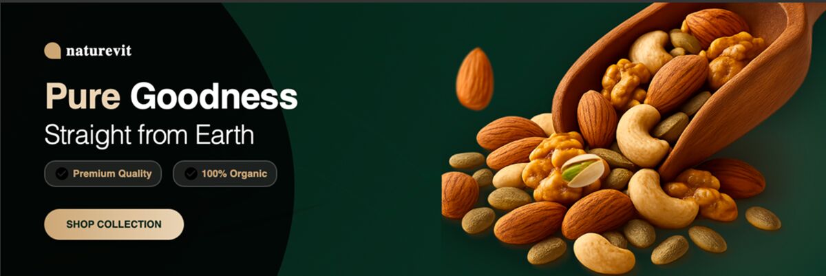
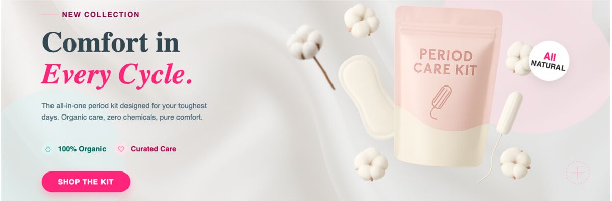
A Shopify banner should do one clear job: communicate what is relevant now and direct shoppers to a next action.

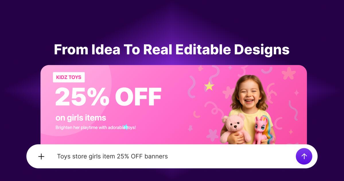
Banner essentials
- Clear offer headline
- Relevant product visual
- Visible CTA
- Clean spacing
Working sizes to test first
- Desktop hero: 1600x500
- Standard wide: 1200x400
- Mobile-safe: 800x400
Build process
- Pick one campaign objective
- Generate three layout options
- Choose best mobile readability
- Publish and compare click behavior
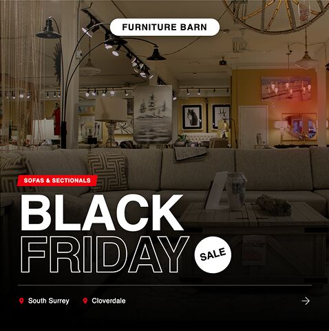
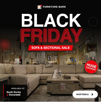
Use Shopify Banner for fast draft generation, then align banner messaging with ads and email campaigns.
Quick practical example
Example: shorter headline + clearer CTA banner beat visually richer designs in click tests.
Mistakes to avoid
- Too many products in one banner
- Hidden CTA zones
- Poor mobile crop checks
Before you publish checklist
- One offer
- Clear CTA
- Mobile-tested
Topics covered
Create with DesignLumo
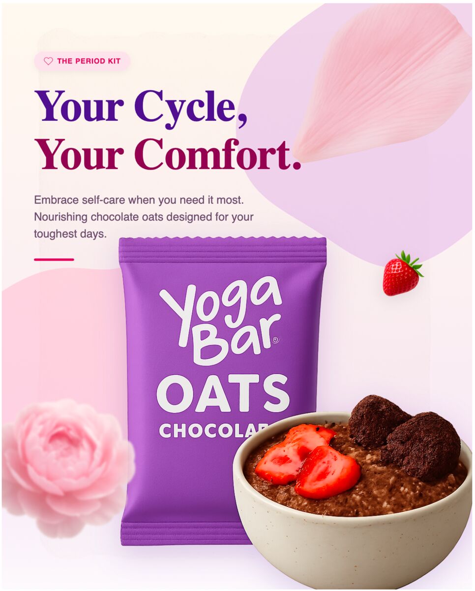
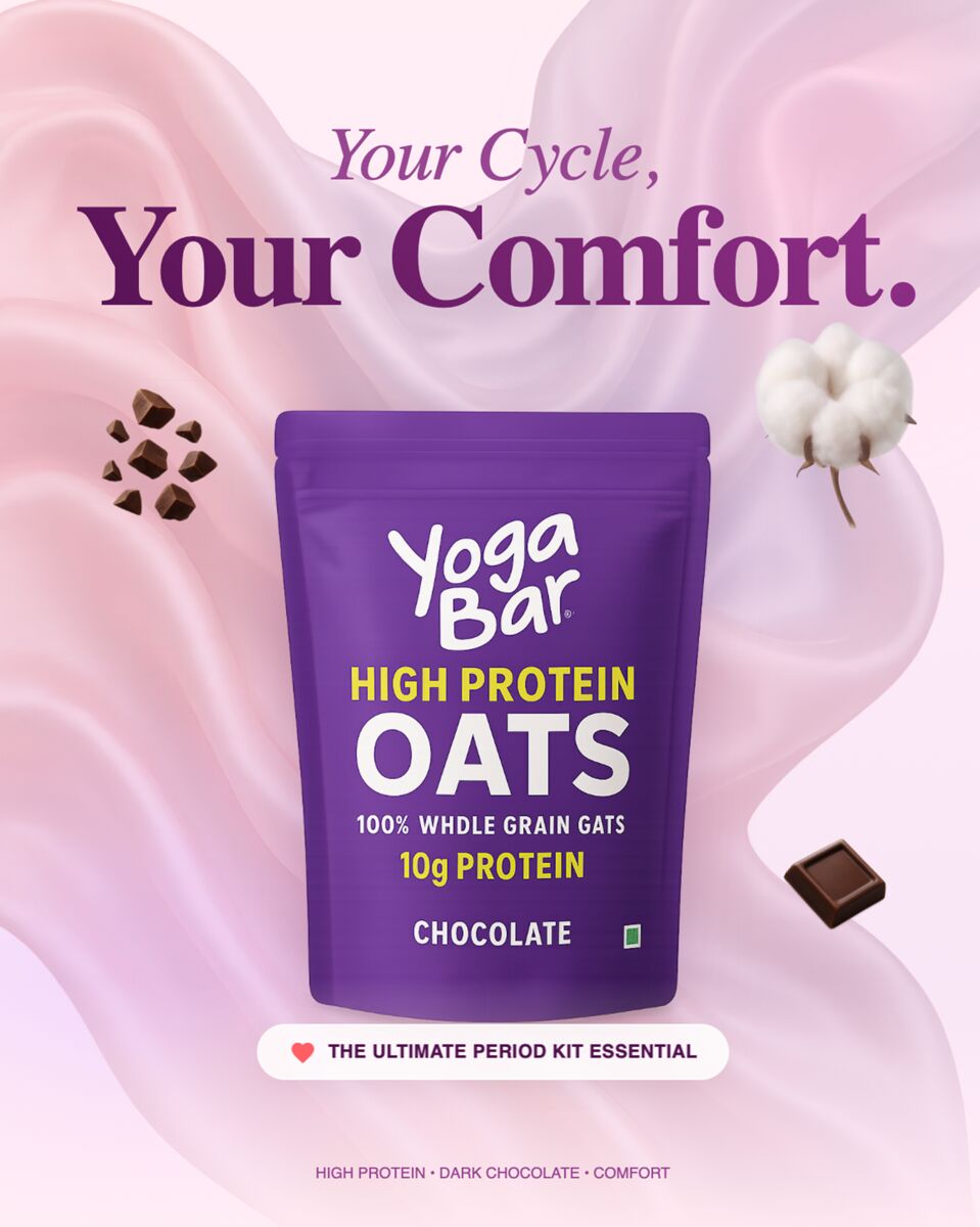
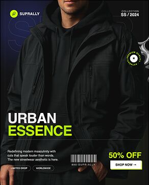
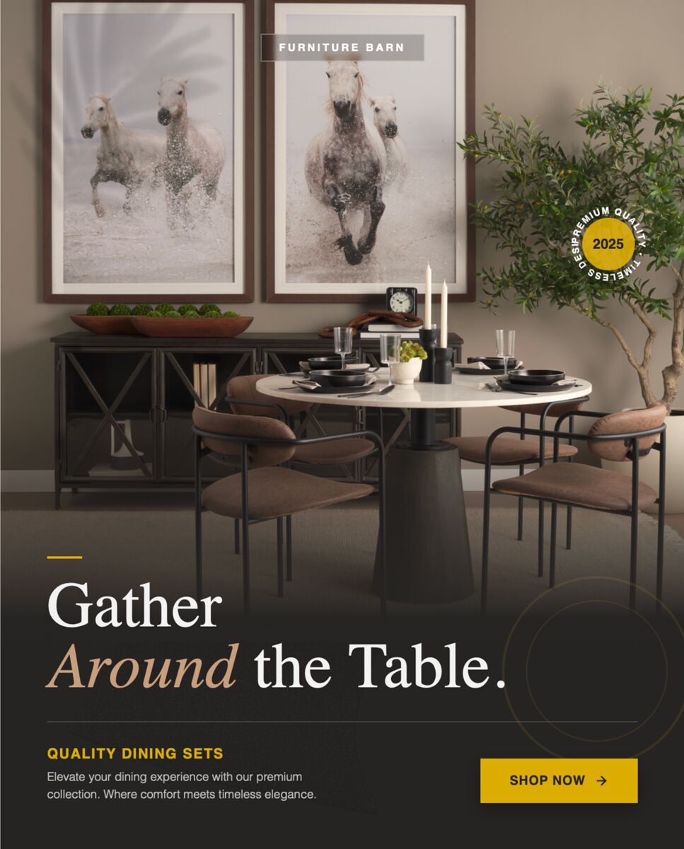


Ready to create your first design?
Join thousands creating professional designs in seconds.
Related articles
A/B Testing Email Visuals: What Actually Moves the Needle for Agencies
Learn which email header and hero image elements to A/B test, how to structure experiments, and read results that boost e‑commerce and SaaS campaigns.
The Ad Creative Brief Template for Performance Agencies
A fill‑in‑the‑blank Facebook ad brief that cuts revisions, speeds up 10+ variant creation, and beats creative fatigue for performance marketers.
Ad Creative Formats That Actually Convert in 2026
Discover the 4 ad creative formats that consistently convert email campaigns in 2026, with clear use‑cases for e‑commerce and SaaS agencies.