Best Fonts for Social Media Posts (and How to Pair Them)
Use this practical font guide to choose readable, brand-safe font pairings for social media posts and ad creatives.
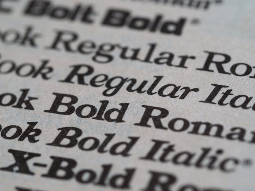
Fonts affect engagement because they affect comprehension speed. If people cannot read your message in the first second, the design has already failed.


Use this guide as a practical selection system: pick one headline font, one body font, and keep that pair consistent for at least 10 posts before changing.
Best headline fonts
Choose headline fonts that stay readable at small mobile sizes and still carry clear personality in-feed.
Montserrat
Headline fontThe quick brown fox 123
Best for: Bold promo headlines
Weight: 600-700
Fallback: Arial, sans-serif
Poppins
Headline fontThe quick brown fox 123
Best for: Rounded modern headlines
Weight: 500-700
Fallback: Verdana, sans-serif
Oswald
Headline fontThe quick brown fox 123
Best for: Condensed sale banners
Weight: 500-700
Fallback: Arial Narrow, sans-serif
Bebas Neue
Headline fontThe quick brown fox 123
Best for: Short all-caps titles
Weight: 400
Fallback: Impact, sans-serif
Playfair Display
Headline fontThe quick brown fox 123
Best for: Luxury or editorial posts
Weight: 600-700
Fallback: Georgia, serif
Headline rule: if your main claim is not readable at arm's length on a phone, the font is too weak for social.
- DesignLumo readability framework
Best body and CTA fonts
Body and CTA fonts should feel neutral and familiar. Their job is to reduce friction, not add style noise.
Inter
Body and CTA fontThe quick brown fox 123
Best for: Dense body copy
Weight: 400-500
Fallback: Helvetica, sans-serif
Open Sans
Body and CTA fontThe quick brown fox 123
Best for: Friendly CTA/body text
Weight: 400-600
Fallback: Arial, sans-serif
Lato
Body and CTA fontThe quick brown fox 123
Best for: Balanced ad descriptions
Weight: 400-700
Fallback: Trebuchet MS, sans-serif
DM Sans
Body and CTA fontThe quick brown fox 123
Best for: Minimal UI-heavy creatives
Weight: 400-600
Fallback: Arial, sans-serif
Roboto
Body and CTA fontThe quick brown fox 123
Best for: Performance ad body copy
Weight: 400-500
Fallback: Helvetica, sans-serif
CTA copy defaults that stay readable
Minimum CTA size: 16px on 1080x1080 posts
Body and CTA fontThe quick brown fox 123
Use semibold weight for CTA labels (500-600)
Body and CTA fontThe quick brown fox 123
Avoid decorative fonts for prices, dates, and discount percentages
Body and CTA fontThe quick brown fox 123
Keep CTA line length under 24 characters
Body and CTA fontThe quick brown fox 123
Reliable font pairs
Use one pair per campaign. Repetition improves recognition and reduces design decision fatigue.
Montserrat + Inter
Fast, readable headline
Supporting body copy that stays clear on mobile screens.
Best use: DTC product drops and paid social
Tone: Clean, high-contrast, conversion-focused
Poppins + Open Sans
Fast, readable headline
Supporting body copy that stays clear on mobile screens.
Best use: Creator brands and community offers
Tone: Friendly, modern, approachable
Bebas Neue + DM Sans
Fast, readable headline
Supporting body copy that stays clear on mobile screens.
Best use: Limited-time offers and flash sales
Tone: High impact headline with clear support text
Playfair Display + Lato
Fast, readable headline
Supporting body copy that stays clear on mobile screens.
Best use: Beauty, fashion, and premium launches
Tone: Elegant headline with practical readability
Oswald + Roboto
Fast, readable headline
Supporting body copy that stays clear on mobile screens.
Best use: Events, webinars, and webinar reminders
Tone: Compact, structured, and direct
How to pick your pair in 60 seconds
Pick campaign tone: premium, playful, urgent, or minimal
Headline fontThe quick brown fox 123
Select one headline font that matches tone
Headline fontThe quick brown fox 123
Pair with a neutral body font from Inter, Open Sans, Lato, DM Sans, or Roboto
Headline fontThe quick brown fox 123
Preview on mobile at 50% screen brightness
Headline fontThe quick brown fox 123
Lock pair for the next 10 posts and measure performance
Headline fontThe quick brown fox 123
Fast readability checks
- 2-second scan test
- Small thumbnail preview test
- Low-brightness mobile check
A quick scoring method
- 5/5: message readable in under 2 seconds and CTA obvious
- 3/5: message readable but CTA or hierarchy is unclear
- 1/5: user must zoom or re-read to understand the offer
Generate quick typography variants in Instagram Post Maker and keep the pair with fastest comprehension.
Quick practical example
Example: switching from thin decorative fonts to Montserrat + Inter improved readability and reduced misunderstanding in ad tests. The same offer text saw stronger click-through because users understood it faster.
Mistakes to avoid
- Using too many fonts
- Low contrast over photos
- Long all-caps lines
Common fixes
- If headline feels weak: increase weight before increasing size
- If layout feels crowded: reduce font count to 2 total families
- If premium style hurts readability: keep premium font only in headline
- If brand feels inconsistent: document one approved pair per campaign type

Before you publish checklist
- 2-second scan passes
- Mobile preview clear
- Pair consistency maintained
Final rule: consistency beats novelty. A stable, readable font system usually outperforms frequent style changes.
Topics covered
Create with DesignLumo


Ready to create your first design?
Join thousands creating professional designs in seconds.
Related articles
AI Prompt Templates for Design: Get Better Output Every Time
Learn structured AI prompt templates that let full‑service agencies churn out on‑brand ad, landing page and email designs fast and consistently.
Announcement Post Templates for Every Campaign Type – A Guide for Full-Service Digital Agencies
Ready-to-use announcement post templates for product launches, hires, milestones, and partnerships. Cut design bottlenecks and keep brand consistency across 10‑50 clients.
Batch Content Creation System That Actually Works for Full‑Service Digital Agencies
Learn a proven batch content creation workflow that lets agencies produce a month of ads, socials, and emails in one session—speed up launches and keep branding razor sharp.